Accessible websites and design - two terms that are often seen as opposites. On the one hand, there are clear requirements for accessibility, readability and technical standards. On the other hand, there is creative design freedom, brand-specific aesthetics and user experience.
But do we really have to choose?
The short answer: no.
The better answer: If you take a strategic approach, you can ideally combine accessible websites and design.
What does "accessible websites" actually mean?
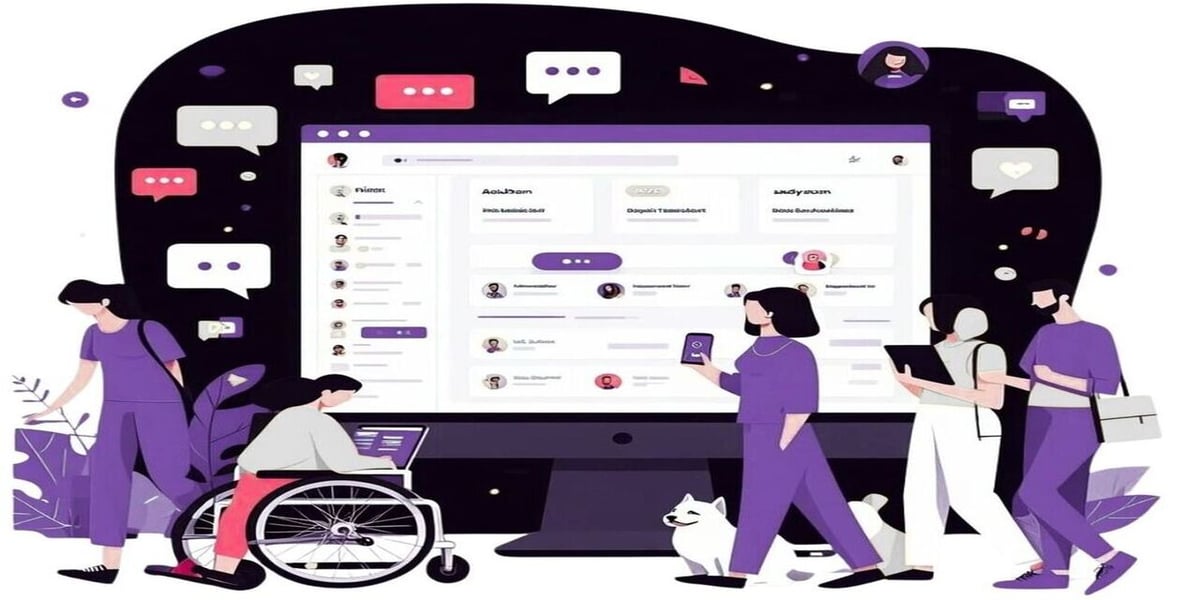
Web accessibility means that all people - regardless of physical or cognitive limitations - can use content without restrictions. This applies, for example, to people with visual impairments, motor impairments or reading difficulties.
The legal basis in Germany is provided by the Barrier-Free Accessibility Reinforcement Act (BFSG), which will also affect private companies from June 2025. The Web Content Accessibility Guidelines (WCAG) define the technical requirements internationally. You can find out how companies can implement these legal requirements for accessible websites in our podcast episode: "Accessible websites: How companies can implement new laws".
Why the "design vs. web accessibility" debate is wrong
When it comes to accessible websites, many companies automatically think of slimmed-down designs: large black font on a white background, no animations, no emotions. This is a misunderstanding.
Accessible websites are not a design killer. On the contrary: by definition, good design is accessible. It guides users intuitively, reduces complexity and creates trust - exactly what accessibility demands.
The 5 most common preconceptions about accessible websites - and how to refute them
1. "Web accessibility looks boring."
Wrong. A clearly structured layout, sufficient contrast and good readability do not exclude creativity. Color systems can be adapted intelligently without losing the brand identity.
2. "We have to start from scratch with the creation of our website to make it accessible."
Targeted adjustments are often enough: semantic HTML structure, alt texts, focus states or color contrasts. Existing designs can usually be reused.
3. "Accessible websites: That's only for public authorities."
The BFSG will also apply to many private online offerings from 2025 at the latest. And even if it is not mandatory: accessibility is customer service - and a competitive advantage.
4. "Our target group doesn't need accessible websites."
You can never say that with certainty. Many restrictions are not visible - or are temporary (e.g. due to illness or technical limitations). The broader the usability, the greater your reach.
5 "Accessible websites limit our design options."
Good accessibility standards promote UX and usability - both central elements of modern web design.
How to combine web accessibility and design - in a practical way
1. work with design systems
A well thought-out design system with accessible components (buttons, forms, navigation, etc.) saves effort and creates consistency. Tools such as Storybook, Figma with accessibility plugins or WCAG-compliant CSS libraries help with this.
2. think mobile first - but barrier-free with
Touch operation, sufficient spacing between clickable elements, responsive layout and focus indicators: this not only improves accessibility, but also the mobile experience.
3. consciously choose contrasts for accessible websites
Color psychology is allowed - as long as the contrasts are right. Use tools such as the WCAG Color Contrast Checker or Stark for Figma to check contrasts in real time.
4. make interactions visible
Buttons, links and forms should be visually and technically clearly recognizable - even using the keyboard. Do not remove the focus frame (outline), but design it!
5. structure content in a structured way
Use heading hierarchies (H1-H6), lists, labels and semantic tags correctly. This not only helps screen readers, but also user guidance.
6. offer alternative content
Videos with subtitles, images with alt texts, PDFs as HTML versions - this not only expands your target group, but also ensures SEO optimization.
7. test with real users
Tools and checklists are good, but nothing replaces real feedback. Let people with different needs test your website - or use screen readers yourself to get a feel.
Conclusion - Accessible websites & design
An accessible website is not an option, but a prerequisite for digital quality. It is an expression of professionalism, attitude and customer centricity. And the best thing is: you don't have to sacrifice design for it. On the contrary - accessibility makes good design visible, understandable and tangible for everyone.
Next steps for your team
- Audit: Check your website for accessibility (tools such as axe DevTools or WAVE can help).
- Training: Sensitize your team to the topic - design, development, content.
- Roadmap : Create an implementation plan with quick wins and long-term measures.
- Find partners: Bring in external experts who combine accessibility and UX.
If you are still looking for a partner, we at CIXON will be happy to support you. Simply book a free initial appointment and let's work together to make your website accessible.


